Interactive visualization allows deeper exploration of data than static plots. Javascript libraries such as d3 have made possible wonderful new ways to show data. Luckily the R community has been active in developing R interfaces to some popular javascript libraries to enable R users to create interactive visualizations without knowing any javascript.
In this post I have reviewed some of the most common interactive visualization packages in R with simple example plots along with some comments and experiences. Here are the packages included:
- ggplot2 - one of the best static visualization packages in R
- ggvis - interactive plots from the makers of ggplot2
- rCharts - R interface to multiple javascript charting libraries
- plotly - convert ggplot2 figures to interactive plots easily
- googleVis - use Google Chart Tools from R
You can either jump straight to the example visualization or read my comments first. The R markdown source code for this blog post with embedded visualizations can be found in Github. I have probably missed some important features and documentation, and also clear mistakes are possible. Please point those out in the comments, and I’ll fix them. It is also important to note that I am a heavy ggplot2 user, and hence my comments may also be biased!
Also other libraries for creating interactive visualizations from R do exist, such as clickme, RIGHT, ggobi, iplots, gg2v, rVega, cranvas and r2d3. Some of these are not under active development anymore. I might include some of those into the comparison here in the future. The d3Network package is also worth checking if you need cool interactive network visualizations.
Technical features
All four packages use javascript for the interactive visualizations, and are cabable of producing most of the standard plot types. The syntaxes vary somewhat, as ggvis uses the pipe operator %>% (familiar for dplyr users), replacing the + in ggplot2. rCharts uses several javascript libraries and also the syntax used varies between different types of charts.
All other packages than googleVis are clearly in an early development phase, which is visible in a limited features and documentation. As an experienced ggplot2 user it was often hard to adapt to the much narrower range of features included in ggvis. For example faceting is a very important feature that hopefully gets implemented soon.
Documentation-wise ggvis and googleVis seem to be the most advanced. rCharts especially suffers from the combination of multiple plot types (named rather uninformatively as rPlot, nPlot and so on) with practically no documentation. So producing anything else than what’s provided in the existing examples was very hard.
googleVis sets itself apart by requiring the data in a different format than the other packages. In Hadley Wickham’s terms, it assumes the data is in the messy format, in contrast to the other packages, tha assume tidy data. This makes it somewhat hard to use, at least when one is used to using tidy data frames. See the examples below for more details.
Plotly is an interesting alternative to the other packages in that it simply takes as input a ggplot2 object and transforms it into an interactive chart that can then be embedded into websites. Using the service requires authentication, which is a clear limitation. By default all plots are made publicly visible to anyone, but there apparently is a way to produce private plots as well, with a limit in their number in the free account.
ggvis is currently the only one of these packages that can not produce map visualizations, but I assume this feature will be added in the future. plotly can use maps created with ggplot2, but not yet with the handy ggmap extension.
Sharing the visualizations
Interactive visualizations are typically meant to be shared for a larger audience. Common ways to share interactive visualizations from R are as standalone html files, embedded in R markdown documents, and embedded in Shiny applications. All the studied packages can produce standalone htmls, though possibly with some loss of interactivity.
R markdown documents are a very nice way of sharing reproducible analyses, using the knitr and rmarkdown packages. Outputs from all the studied visualization packages can be embedded in .Rmd documents, though I had some problems (see the Issues section below). All packages are also compatible with Shiny documents and applications, and have good tutorials for this.
Issues
I encountered several problems when preparing this blog post. Specifically, I had issues in embedding the plots into R markdown documents. This is made more complicated with the various available ways of turning .Rmd files into html: manual knit() and knit2html() functions, the Knit HTML button in RStudio, and a Jekyll-powered blog with its own requirements. Here I have listed the most important issues, with solutions when found. Some things are still unsolved, hope someone can help me with those!
- ggvis showed up nicely with
Knit HTML, as it creates a standalone file with the necessary javascript libraries included. However, this was not the case with my blog setup. My solution was to inlude the set of scripts (taken from the source of this page) into the header of all my blog posts (see here). Not sure if this is an optimal solution. - UPDATE 8.8.2015: After updating the blog theme, the ggvis only show up with Chrome, not with Firefox or Safari. There’s some black magic beyond my understanding going on, so I would really appreciate some help with this!
- rCharts: Embedding rCharts to R markdown did not quite work either as shown e.g. here. With
Knit HTMLbutton the line that worked wasrchars.object$print(include_assets=TRUE), whereas with the blog the line wasrchars.object$show('iframesrc', cdn=TRUE). - plotly: Embedding plotly charts into R markdown documents did not work as shown here, but adding
session="knitr"to theggplotly()call solved the issue (thanks to Scott Chamberlain and Marianne Corvellec for help!). Note that in this post I embedded existing plotly charts manually. - There are still two charts that do now show up in this post. I have quite limited understanding of how knitr, jekyll and the javascript tools work together, and could not get these to work. Perhaps the scripts somehow conflict with each other?
I also noticed some minor issues:
- googleVis was missing axis labels by default
- rCharts is missing legend titles, and behaves strangely on scatter plot: legend shows partially incorrect information, and the plot area is too tight
Summary
In general, being able to produce valid interactive html charts from R markdown without knowing any javascript is great! All of the packages great sensible outputs, but there are also a lot of differences. I love ggplot2, and hence I also like ggvis, as it pays attention to graphical details following the grammar of graphics principles. However, the package is still missing a lot of important features, such as faceting. In many cases rCharts can do what ggvis can not (yet), and so it is a good alternative. However, the missing documentation makes it hard to create customized plots. Plotly has a really nice idea and implementation, but requirement for authentication and limited number of private plots reduce the usability a lot. Google’s Motion charts are cool and useful, but otherwise the input data format logic that differs from the packages makes using the package too hard in practice.
Example visualizations
Here I have made example plots with the interactive tools: histograms, scatter plots and line plots. Source code is available in Github. First we need to install and load the necessary R packages:
## Install necessary packages
install.packages("devtools")
library("devtools")
install.packages("ggvis")
install.packages("googleVis")
install_github("ramnathv/rCharts")
install_github("ropensci/plotly")
install.packages("dplyr")
install.packages("tidyr")
install.packages("knitr")
# Load packages
library("ggvis")
library("googleVis")
library("rCharts")
library("plotly")
library("dplyr")
library("tidyr")
library("knitr")
# Define image sizes
img.width <- 450
img.height <- 300
options(RCHART_HEIGHT = img.height, RCHART_WIDTH = img.width)
opts_chunk$set(fig.width=6, fig.height=4)Plotly needs some setting up (using the credentials from here).
# Plotly requires authentication
py <- plotly("RgraphingAPI", "ektgzomjbx")
Prepare the mtcars data set a bit.
# Use mtcars data
data(mtcars)
mtcars$cyl <- factor(mtcars$cyl)
mtcars$am <- factor(mtcars$am)
# Compute mean mpg per cyl and am
mtcars.mean <- mtcars %>% group_by(cyl, am) %>%
  summarise(mpg_mean=mean(mpg)) %>%
  select(cyl, am, mpg_mean) %>% ungroup()
Histograms
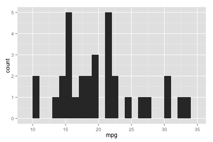
ggplot
hist.ggplot <- ggplot(mtcars, aes(x=mpg)) + geom_histogram(binwidth=1)
hist.ggplot
ggvis
hist.ggvis <- mtcars %>% ggvis(x = ~mpg) %>% layer_histograms(width=1) %>%
  set_options(width = img.width, height = img.height)
hist.ggvisrCharts
# rCharts histogram needs manual binning and counting!
hist.rcharts <- rPlot(x="bin(mpg,1)", y="count(id)", data=mtcars, type="bar")
# Use this with 'Knit HTML' button
# hist.rcharts$print(include_assets=TRUE)
# Use this with jekyll blog
hist.rcharts$show('iframesrc', cdn=TRUE)
Does not show up…
plotly
# This works, but is not evaluated now. Instead the iframe is embedded manually.
py$ggplotly(hist.ggplot, session="knitr")
googleVis
# Number of bins chosen automatically, which is sometimes bad
gvis.options <- list(hAxis="{title:'mpg'}",
                     width=img.width, height=img.height)
hist.gvis <- gvisHistogram(data=mtcars["mpg"], option=gvis.options)
print(hist.gvis, tag="chart")
Scatter plots
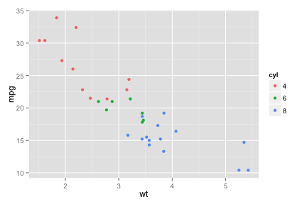
ggplot
scatter.ggplot <- ggplot(mtcars, aes(x=wt, y=mpg, colour=cyl)) + geom_point()
scatter.ggplot
ggvis
scatter.ggvis <- mtcars %>% ggvis(x = ~wt, y = ~mpg, fill = ~cyl) %>%
  layer_points() %>% set_options(width = img.width, height = img.height)
scatter.ggvisrCharts
scatter.rcharts <- rPlot(mpg ~ wt, data = mtcars, color = 'cyl', type = 'point')
# WTF, legend shows 4-7, while the levels are 4,6,8???
# very tight limits, parts of points missing on the edge
# Use this with 'Knit HTML' button
# scatter.rcharts$print(include_assets=TRUE)
# Use this with jekyll blog
scatter.rcharts$show('iframesrc', cdn=TRUE)
plotly
# This works, but is not evaluated now. Instead the iframe is embedded manually.
py$ggplotly(scatter.ggplot, session="knitr")
googleVis
# Spread data to show the wanted scatter plot (unique id required for unique rows)
mtcars$id <- as.character(1:nrow(mtcars))
mtcars.temp <- tidyr::spread(mtcars[c("wt", "mpg", "cyl", "id")], key=cyl, value=mpg)
gvis.options <- list(hAxis="{title:'wt'}", vAxis="{title:'mpg'}",
                     width=img.width, height=img.height)
scatter.gvis <- gvisScatterChart(select(mtcars.temp, -id), options=gvis.options)
print(scatter.gvis, tag="chart")
Line plots
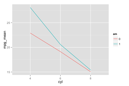
ggplot
line.ggplot <- ggplot(mtcars.mean, aes(x=cyl, y=mpg_mean, colour=am)) +
  geom_line(aes(group=am))
line.ggplot
ggvis
line.ggvis <- mtcars.mean %>% ggvis(x = ~cyl, y = ~mpg_mean, stroke = ~am) %>%
  layer_lines() %>% set_options(width = img.width, height = img.height)
line.ggvisDoes not show up…
rCharts
line.rcharts <- hPlot(x="cyl", y="mpg_mean", group="am", data=mtcars.mean, type="line")
# Use this with 'Knit HTML' button
# line.rcharts$print(include_assets=TRUE)
# Use this with jekyll blog
line.rcharts$show('iframesrc', cdn=TRUE)
plotly
# This works, but is not evaluated now. Instead the iframe is embedded manually.
py$ggplotly(line.ggplot, session="knitr")
googleVis
# Spread data to show the wanted line plot
mtcars.mean.temp <- tidyr::spread(mtcars.mean, key=am, value=mpg_mean)
gvis.options <- list(hAxis="{title:'cyl'}", vAxis="{title:'mpg_mean'}",
                     width=img.width, height=img.height)
line.gvis <- gvisLineChart(xvar="cyl", yvar=c("0", "1"), data=mtcars.mean.temp,
                           options=gvis.options)
print(line.gvis, tag="chart")
Session info
sessionInfo()## R version 3.1.2 (2014-10-31)
## Platform: x86_64-apple-darwin13.4.0 (64-bit)
##
## locale:
## [1] en_US.UTF-8/en_US.UTF-8/en_US.UTF-8/C/en_US.UTF-8/en_US.UTF-8
##
## attached base packages:
## [1] stats graphics grDevices utils datasets methods base
##
## other attached packages:
## [1] tidyr_0.1 dplyr_0.3.0.2 plotly_0.5.10 ggplot2_1.0.0
## [5] RJSONIO_1.3-0 RCurl_1.95-4.3 bitops_1.0-6 rCharts_0.4.5
## [9] googleVis_0.5.6 ggvis_0.4.0.9000 knitr_1.8
##
## loaded via a namespace (and not attached):
## [1] assertthat_0.1 colorspace_1.2-4 DBI_0.3.1 digest_0.6.4
## [5] evaluate_0.5.5 formatR_1.0 grid_3.1.2 gtable_0.1.2
## [9] htmltools_0.2.6 httpuv_1.3.2 jsonlite_0.9.13 labeling_0.3
## [13] lattice_0.20-29 lazyeval_0.1.9 magrittr_1.0.1 MASS_7.3-35
## [17] mime_0.2 munsell_0.4.2 parallel_3.1.2 plyr_1.8.1
## [21] proto_0.3-10 R6_2.0 Rcpp_0.11.3 reshape2_1.4
## [25] scales_0.2.4 shiny_0.10.2.1 stringr_0.6.2 tools_3.1.2
## [29] whisker_0.3-2 xtable_1.7-4 yaml_2.1.13